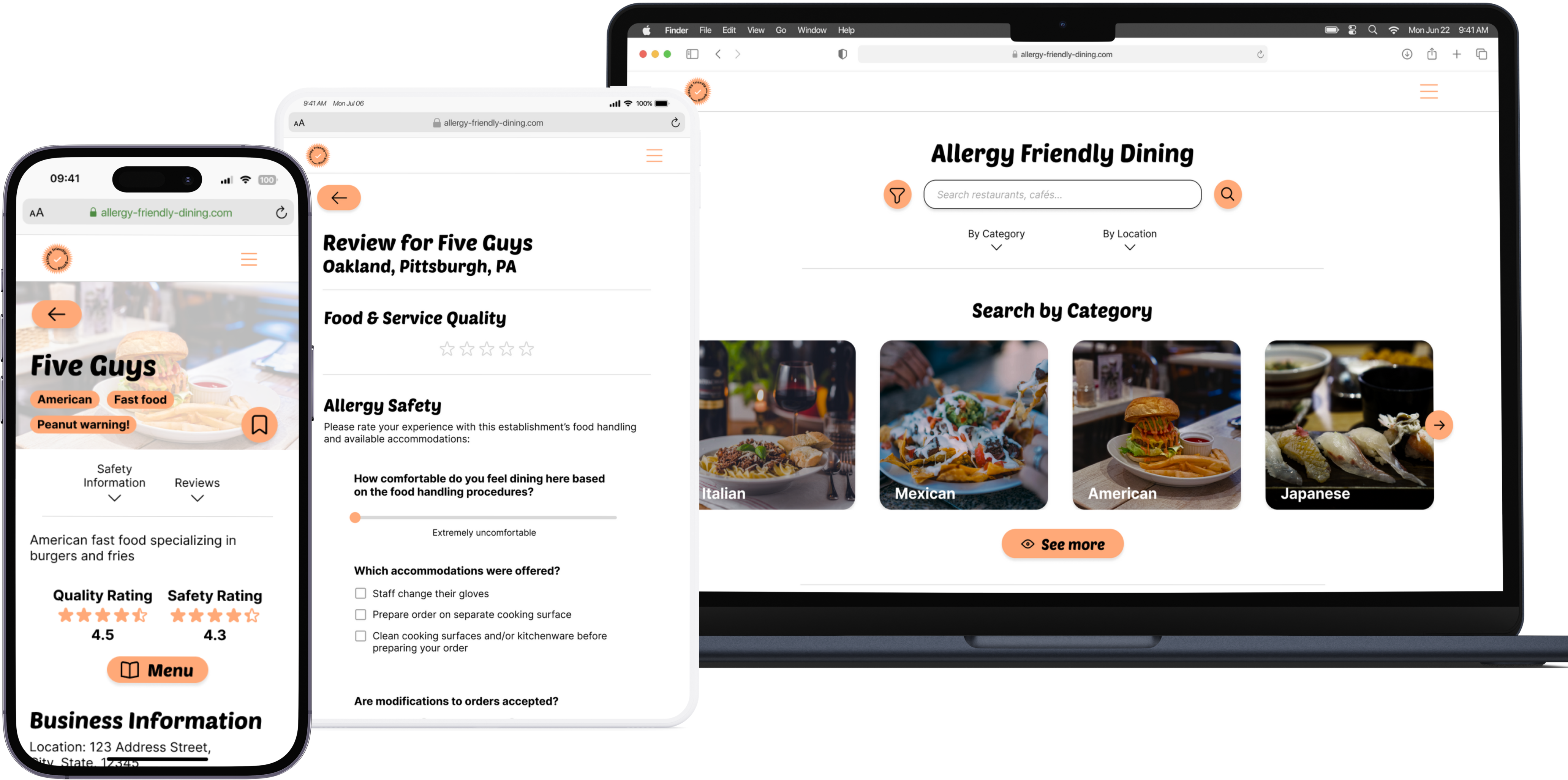
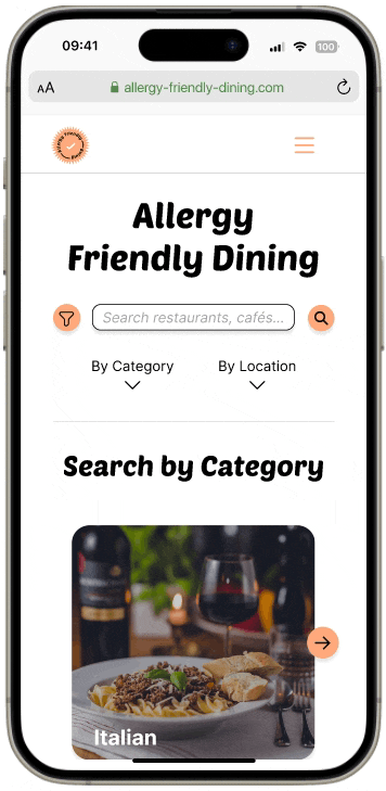
Mockups of AFD platform on various devices
Responsive Website Design

Allergy Friendly Dining

Allergy Friendly Dining is a platform dedicated to helping people with allergies make informed decisions about their dining options. This product is a mobile-first responsive website that a) provides valuable insights about businesses' food handling practices and allergy accommodations and b) allows users to give food businesses an allergy safety rating through reviews.
ROLE
UX Research
UX Design
TEAM
Self-directed
Client
Google UX Design
Certificate Program,
Passion project
TIMELINE
Jan 2024 - Apr 2024
(~10 weeks)

overview

Question mark icon
Problem
People who use reviews on services such as Yelp and Google Reviews to learn about food businesses are often faced with pages of unhelpful information and frustration in finding answers for their concerns, especially when researching places that can best accommodate food allergies and dietary restrictions. 
Target with arrow in bullseye icon
Goal
My goals are to...

1. Make information about food businesses easily accessible, particularly their level of accommodation for customers with allergies and dietary restrictions.

2. Allow the community to contribute useful information in a simple process.
Star icon
challenge
How might we create a platform that streamlines the process of researching food businesses to support a community of people with various food allergies and dietary restrictions?
Exclamation mark icon
solution
A mobile-first responsive website that compiles information about a food business’s food handling practices from the business itself as well as reviews from customers about their experiences with allergy accommodations while dining at the business. 

research

Target users
1. People who have food allergies or dietary restrictions and are looking for a place to eat that serves or can accommodate safe, allergen-free food.

2. People who do not have allergies or dietary restrictions and would like an easier way to find reliable, up-to-date reviews for restaurants they are interested in.
user problems

To better understand how users currently search for places that can accommodate their needs and any associated pain points, I conducted user interviews with 7 participants, both with and without food allergies.


Insights:

  • Information regarding a business’s accommodations for allergy/dietary restrictions is difficult to find or inaccessible
  • Sorting search results by “most relevant” is vague and therefore useless
  • Reviews for business are sometimes unreliable or seem untrustworthy

design concept

user problems
To address the issues users currently face, I identified key features to include in the platform, categorized by the main tasks users need to perform:
  1. Searching for a suitable business
    • A way to show only the businesses that offer accommodations for selected allergens/restrictions
    • A way to warn users of potential threats at particular businesses
  2. Reading a business’s page
    • A summary of business’s allergen safety and ratings
    • A way to show only the reviews that mention certain allergens/restrictions
  3. Writing a review
    • A brief rating system for the business’s food + service quality
    • A way to assess particular aspects of a business’s allergy/restriction accommodations
Main features
Arrow pointing from the AFD home screen search filter button to the zoomed-in filter overlay
Filter search results to only the businesses that can accommodate particular allergens.
AFD business page labels emphasized by a circle annotation
Labels/tags on business pages to describe businesses and warn users of potential allergen threats.
Arrows pointing to the quality and safety ratings on a business's page on the AFD website
Separate star ratings for quality & allergy safety to distinguish reviews regarding accommodations from reviews about taste.
Arrow pointing from AFD business reviews section filter button to zoomed-in filter overlay
Filter reviews to show those only with mentions of specified allergens so users can look for relevant information.
AFD write review screen
System of writing business reviews that focus on allergy safety for an objective, informational rating.

user testing

Usability study
After building a prototype focusing on these features, I conducted a usability study with 5 participants to test their functionality and find potential issues with navigating the website. Frustrations and suggestions from each participant’s session provided me with insights on how I could improve the platform.
4 of 5 user icons filled
4 of 5 participants reported that scrolling through search results horizontally feels unintuitive
4 of 5 user icons filled
4 of 5 participants ignored the reviews filter when tasked to search for reviews mentioning specific allergens
3 of 5 user icons filled
3 of 5 participants suggested adding further options to the reviews filter
insights to design changes
Showing the change on the search results page after the usability study
Changed the results to display vertically instead of horizontally. The up-and-down scrolling movement should feel more natural to how users browse websites and apps on their mobile devices (according to users in the study).
Showing the change on the business page reviews section after the usability study
Added brief directions for the reviews filter to call attention to this feature and inform users of its use.
Showing the change on the reviews filter after the usability study
Added a place for users to type any allergens or dietary restrictions. The filter can then include reviews for allergens other than the most common eight.
Showing the change on the home page after the usability study
Due to similar issues to the initial search results view and suggested by one participant, I added a button to display an overlay of the categories in a list view in addition to the horizontal scroll. Users can access all categories more quickly through this navigation.

bringing the designs to life

Other changes included adding a few more buttons to provide various ways of navigating the website as well as a “Sort by rating” dropdown menu for further options to filter search results. Once I adjusted the designs, I added visual identity to the platform. 
colors
Colors used in the visual identity. Primary is white with hex code #FFFFFF, and secondary is orange with hex code #FFA978.
With white as the neutral dominant color, I chose orange as the secondary color because of its association with caution, similar to red in its ability to call attention to threats and important warnings, as well as encouragement, important to making users feel confident in the platform and in their decisions. 
typefaces
Typefaces used in visual identity. Headings are PoetsenOne and body text is Inter.
For headings and button text, I use the sans serif typeface PoetsenOne to create visual interest in the copy with a readable font, somewhat reminiscent of retro American diner signs. 
Overall, I wanted the platform to portray a simple yet interesting visual identity that gives users confidence when searching for safe places to dine.

final designs

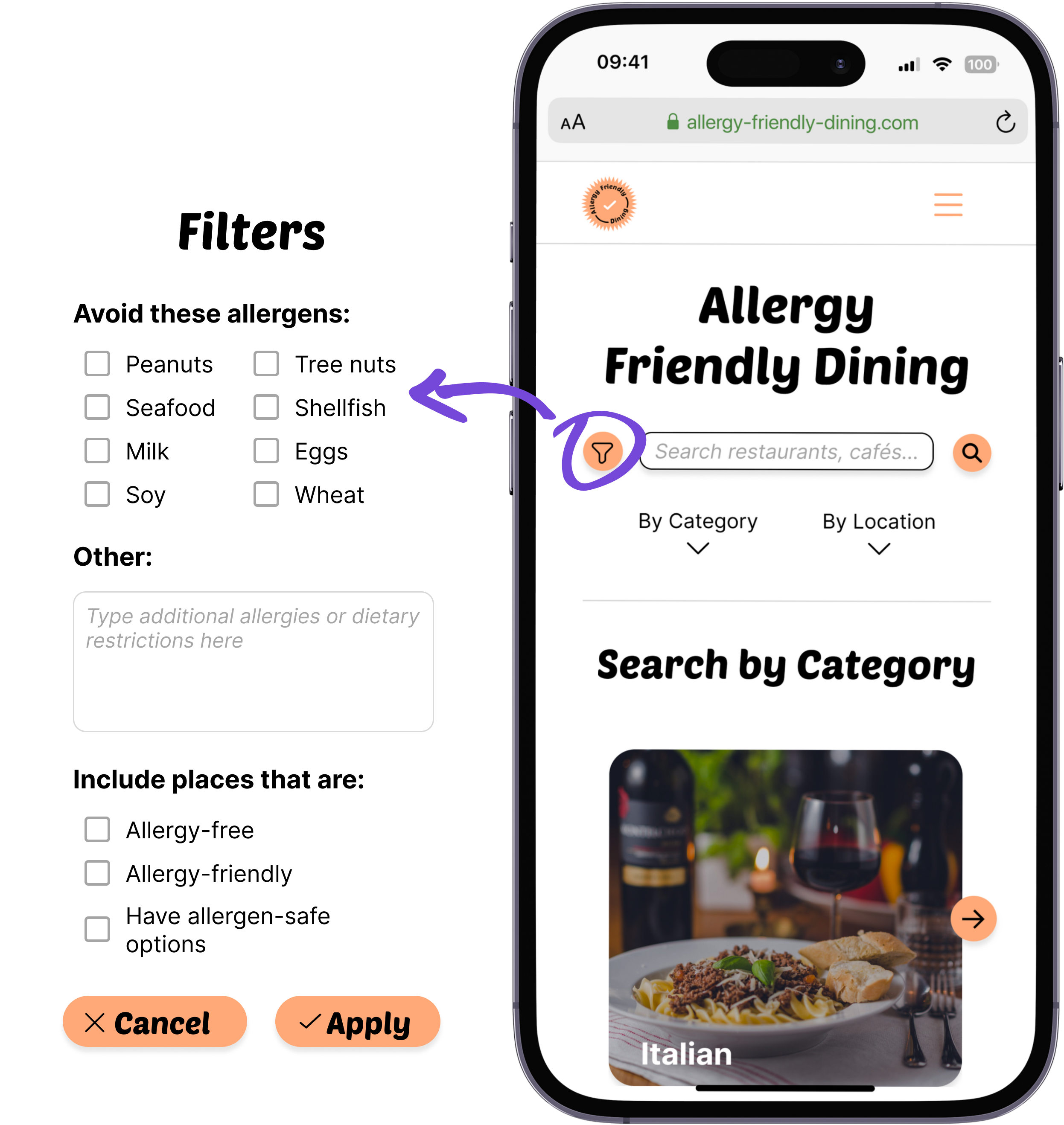
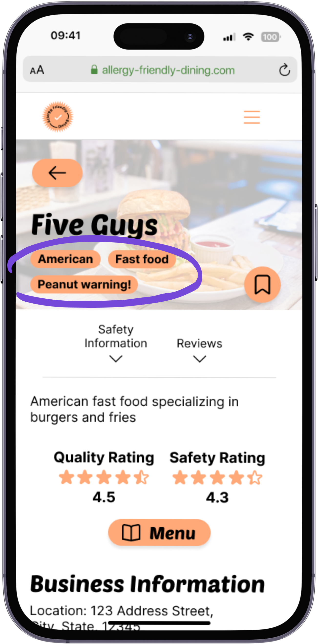
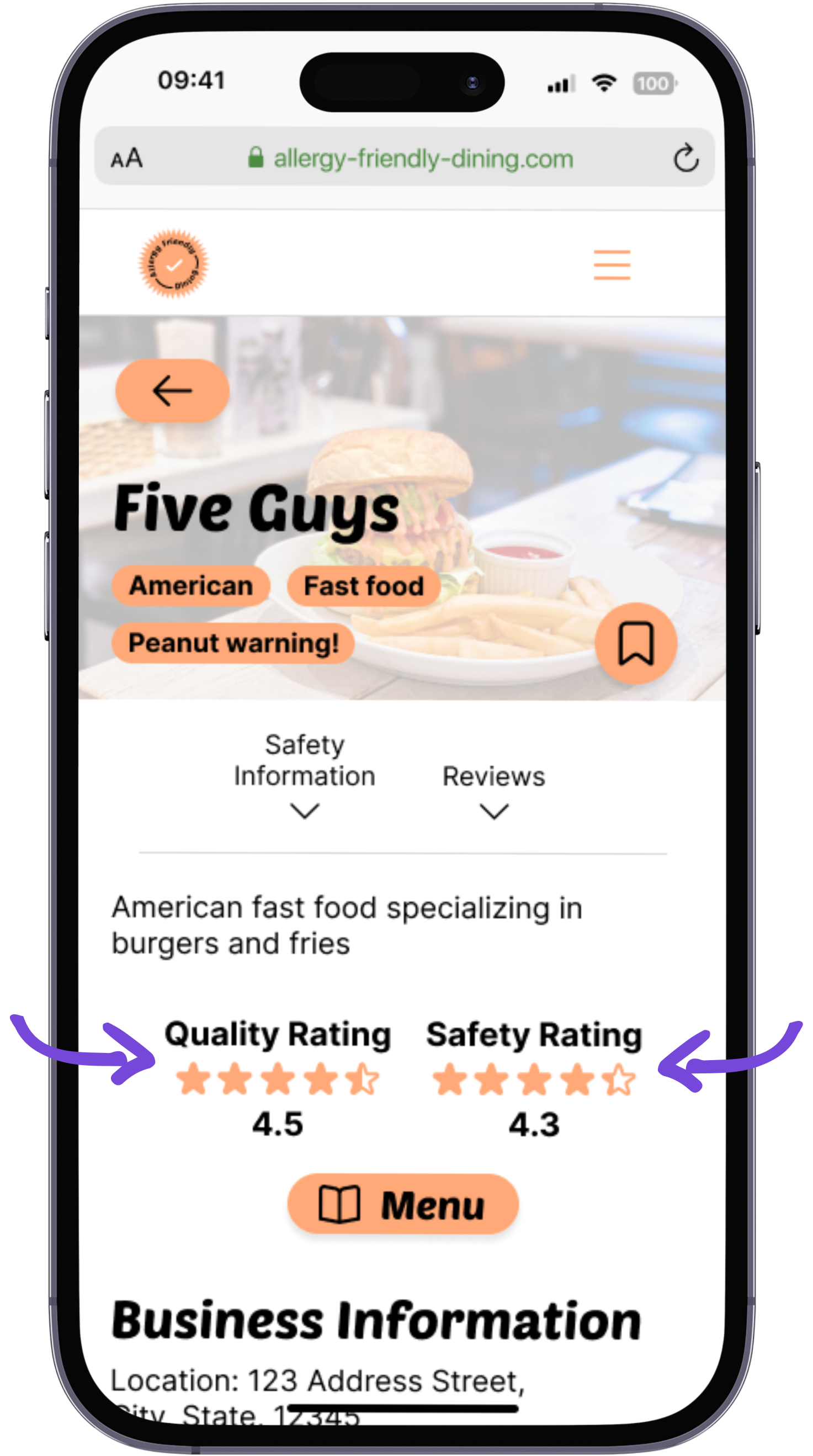
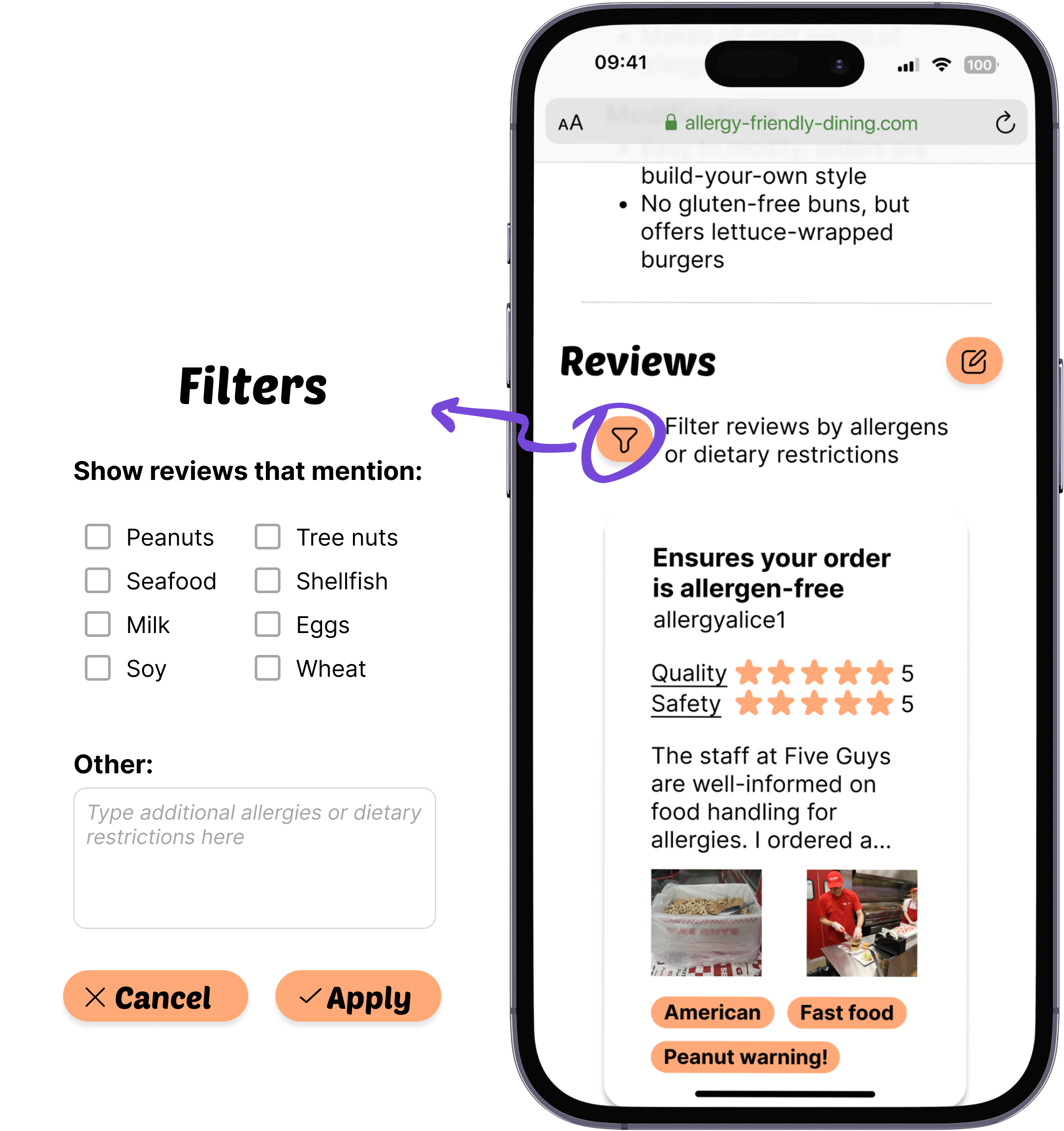
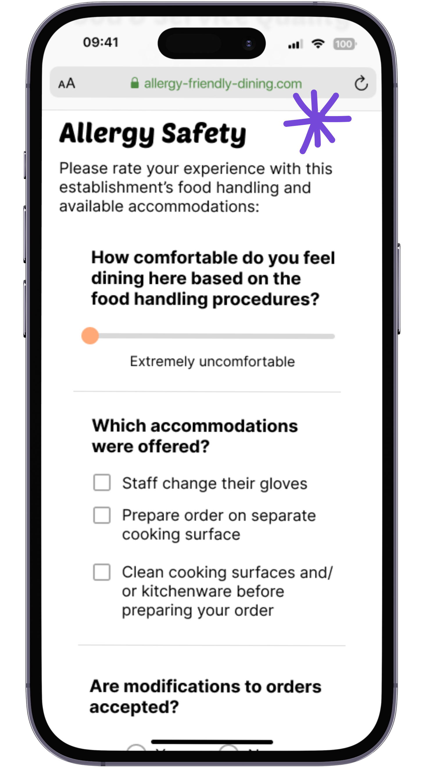
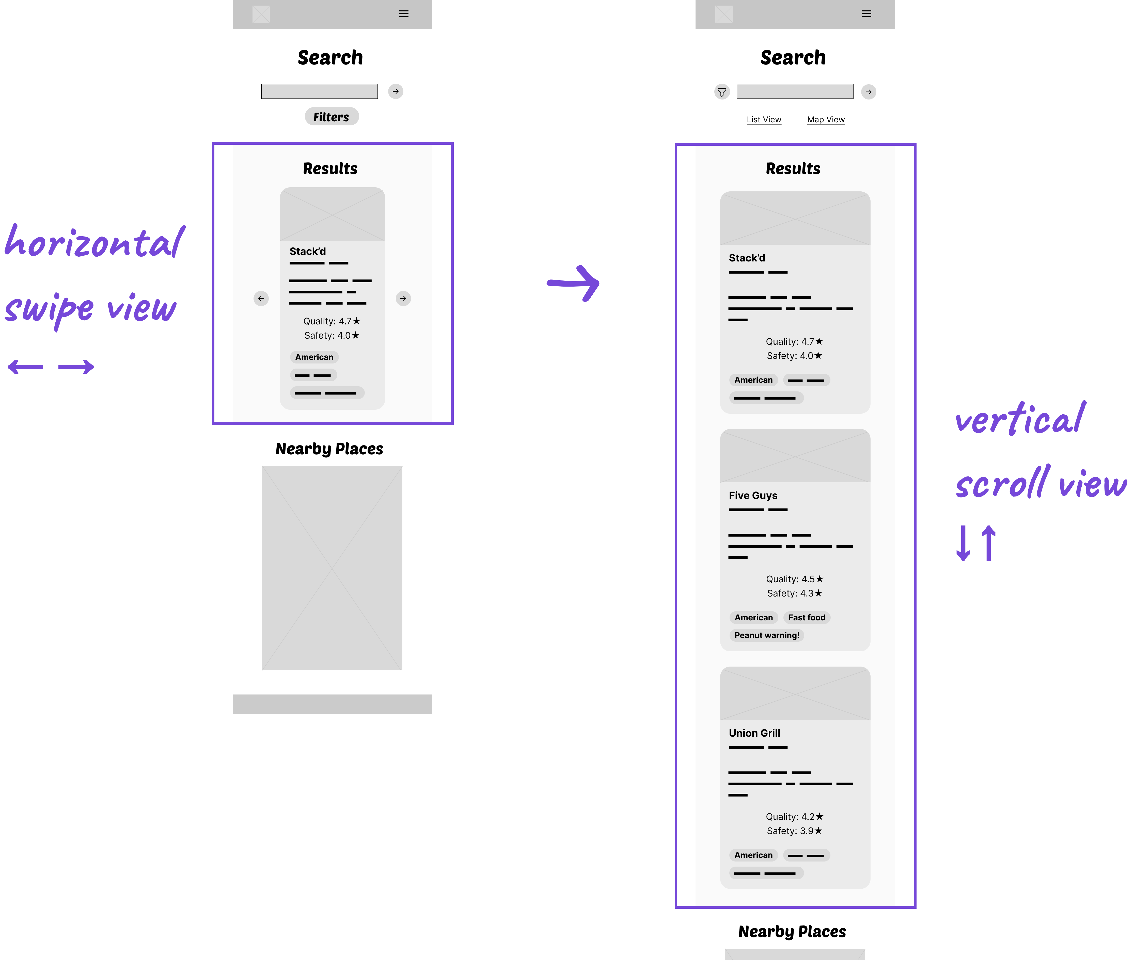
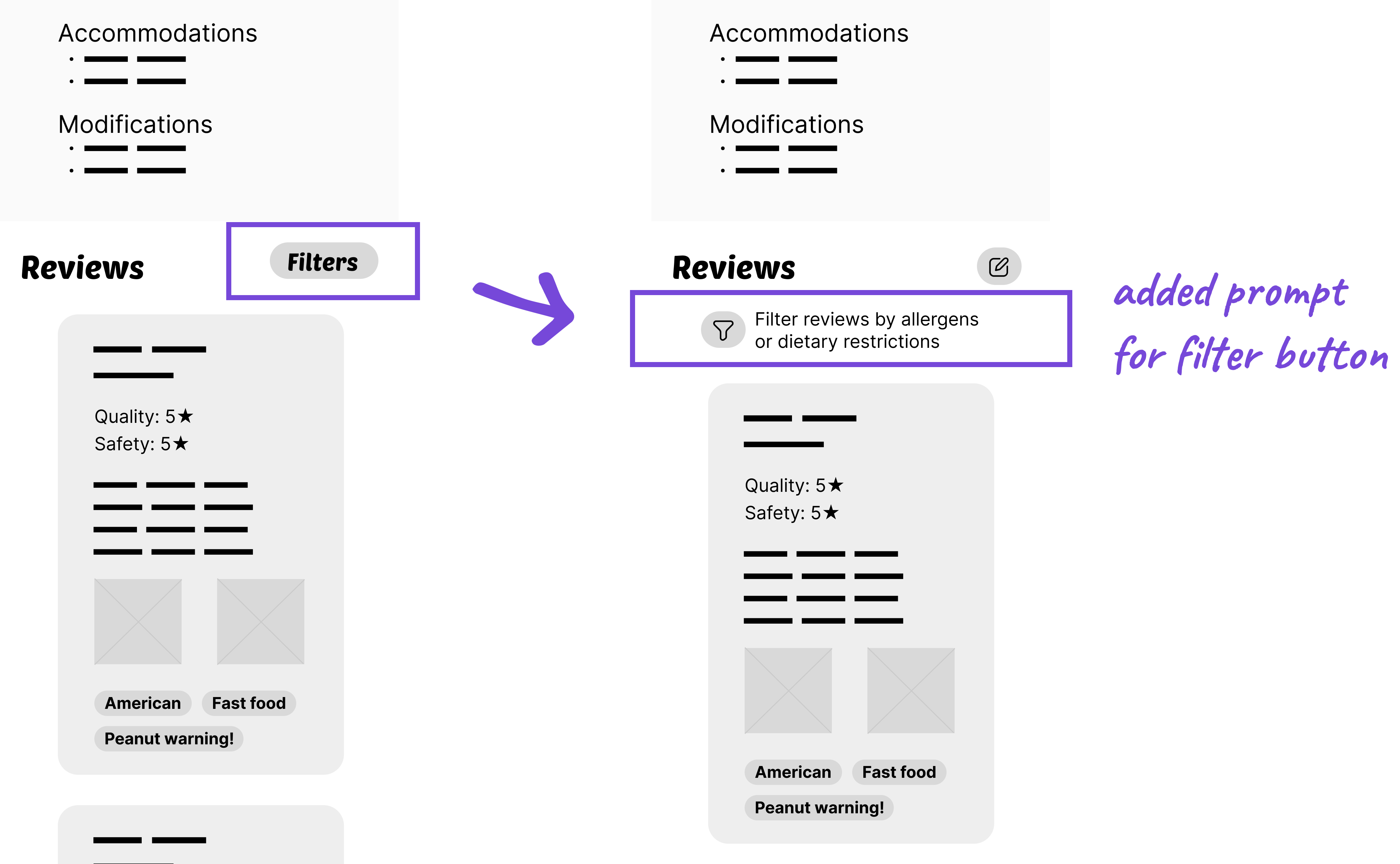
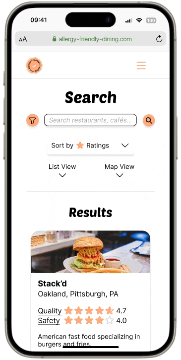
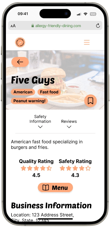
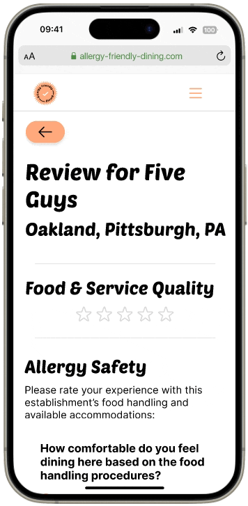
Based on initial user research, many users would use the Allergy Friendly Dining platform when deciding where to eat while on the go, so I designed the website using a mobile-first approach.

The following GIFs show the screens of the user flow and its main features.
GIF of home page, showing category scroll and list views
GIF of search results screen, showing search filter and sort by ratings dropdown menu functions
GIF of business screen, showing tags, quality and safety ratings, the safety info section, and the reviews filter functions
GIF of process of writing a review for a business
impact
The concept for this design project originated from my own struggles with navigating my allergies when dining out, particularly with businesses that are not willing to accommodate a customer like me. Knowing a handful of others who encounter the same issues as I do gave me the idea to create a platform that could make the essential activity of eating less stressful.

When sharing these designs with stakeholders throughout the process, each person found that the Allergy Friendly Dining platform would be highly beneficial not only for those with allergies but also for friends of people with allergies. Here are some of their thoughts:
“It would make it much easier to pick a place safest for everyone. My brother has a very restrictive diet due to colon cancer and one of my best friends has many food allergies themself, ones that are severe. It would alleviate so much anxiety.”
“I could use an app like this to decide whether to bring my friends with allergies to a restaurant instead of having them check the menu/food handling practices beforehand.”
“It would force restaurants to be upfront and disclose the ingredients they use and how they sanitize their equipment that uses those allergens. It would likely make restaurant trips a lot less anxiety inducing for those who have any food allergies.”
If Allergy Friendly Dining and similar platforms can ease people’s searches for accommodating food businesses and encourage restaurants to evaluate their food handling procedures, dining out can become a more accessible and comfortable experience for everyone.

next steps

more usability testing
Due to time constraints, I conducted only one usability study. Especially after incorporating feedback and insights from this study into the high fidelity prototype, I would conduct a second study to determine whether these changes were truly beneficial and if further changes are needed to complete tasks. Additionally, testing with users of different ages and disabilities will help to evaluate the platform for accessibility issues.
Further user research
This version of Allergy Friendly Dining is catered toward people who have food allergies, with functions referencing the eight most common allergies. While there is a text box for users to input “other” allergies and restrictions, there could be a better way to include diverse diets such as Kosher and Halal foods. By conducting user research on the needs of people with various dietary restrictions, I could learn how to expand the platform to accommodate a wider audience.
additional features
The platform is currently functional for its main user flow of searching and writing reviews for businesses; however, it could be more functional with additional features. For example, the Diner Profile is referenced when logging into or signing up for an account in order to write a review, but it doesn’t appear elsewhere on the website. The Diner Profile can be developed as a place to access reviews and drafts, saved business profiles, list of allergens, and more. 

takeaways

Completing this project solo allowed me to explore diverse ideas and refine the scope effectively. Despite the challenges of working without a team, I found freedom in crafting a strong visual identity for a new platform, including the logo and brand colors. I also enjoyed diving into interactive elements in Figma, dedicating time to creating components such as the photos carousel and multi-select dropdown menu. For my first time delving into the practical application of visual identity and Figma components, I had a fun learning experience that I am excited to build upon in future projects.

other work

Mockups of the PorkFolio website displayed in a laptop screen and the desktop app interface.
PorkFolio
Website & App Design, Front-end Development, AI integration
The BoonSeek food truck logo
The BoonSeek Customer Loyalty Program
UX/UI Design, Cross-Platform Design, Usability Testing

Question icons created by Freepik - FlaticonTarget icons created by Freepik - Flaticon
Neon sign icons created by Freepik - Flaticon
Exclamation mark icons created by Freepik - Flaticon