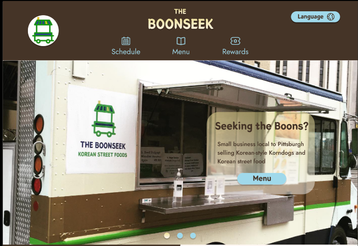
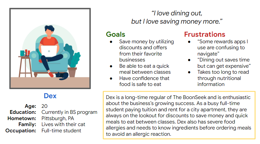
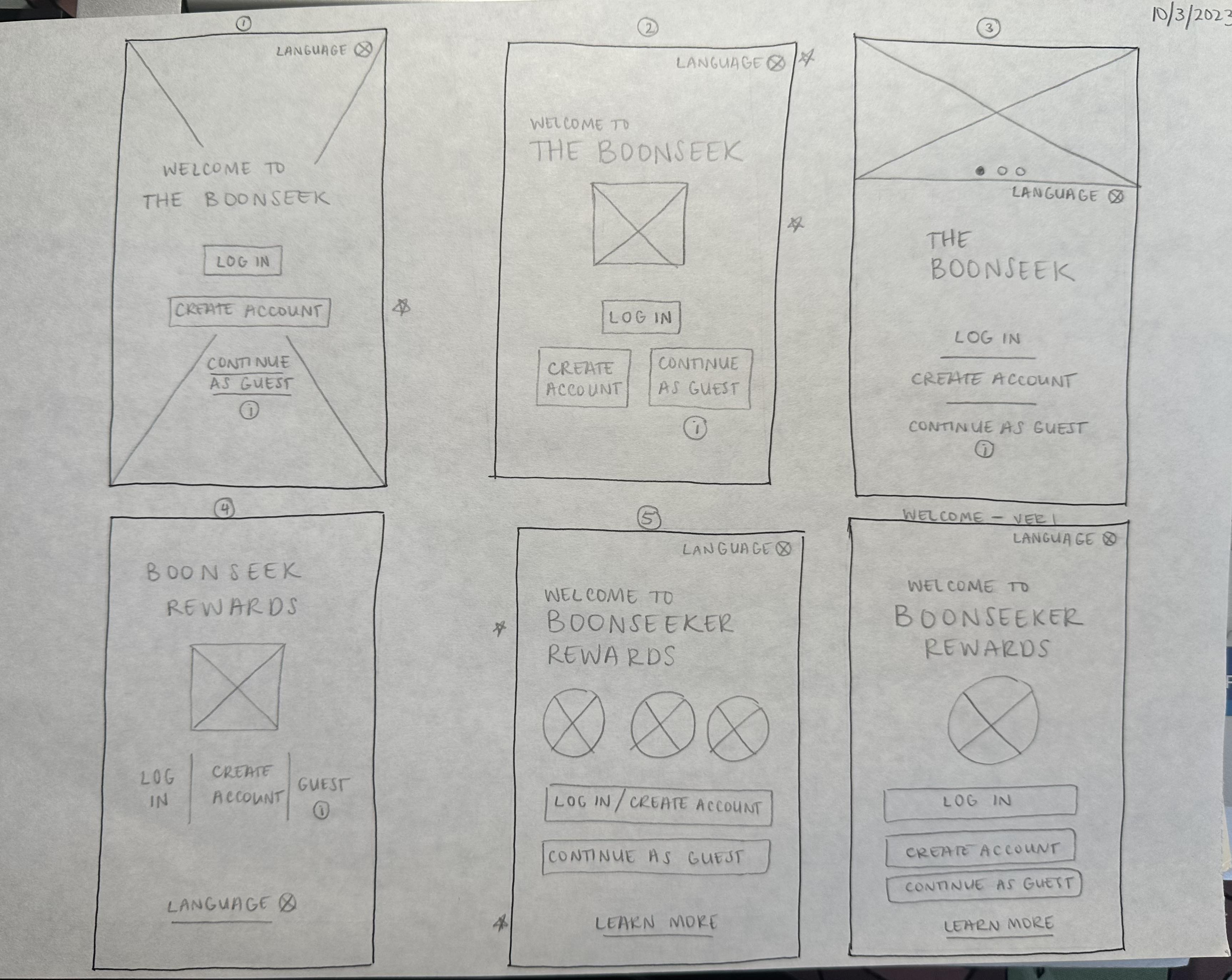
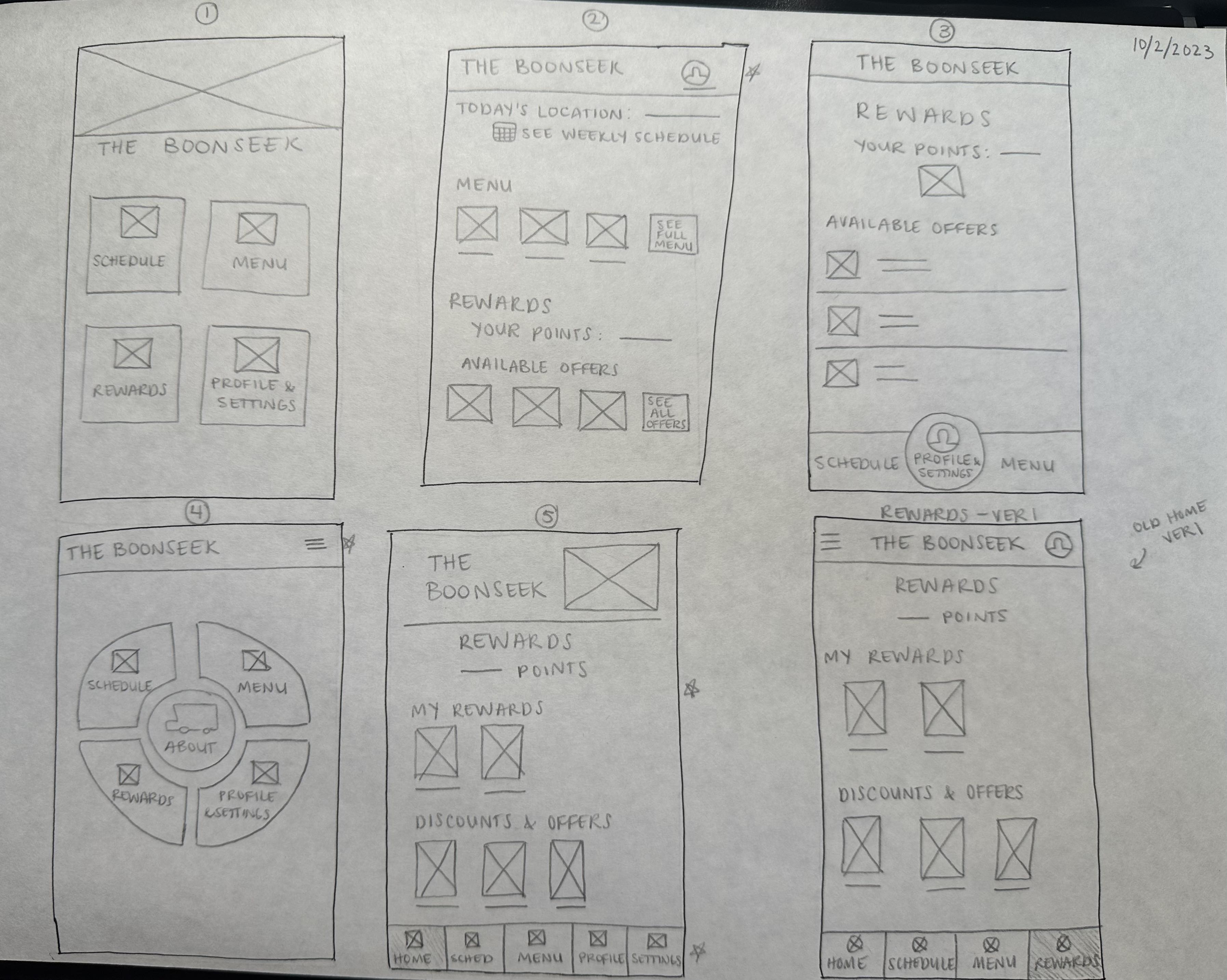
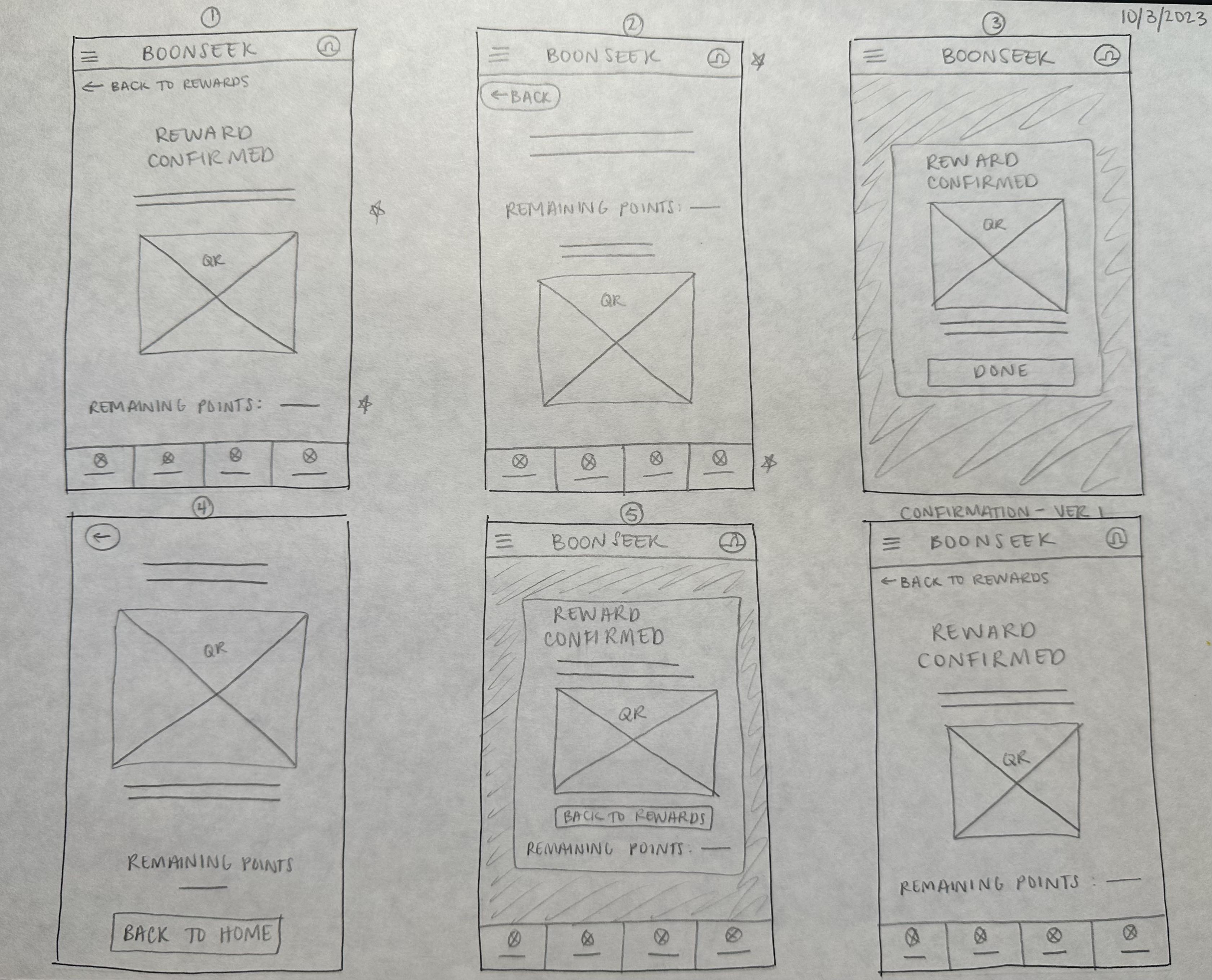
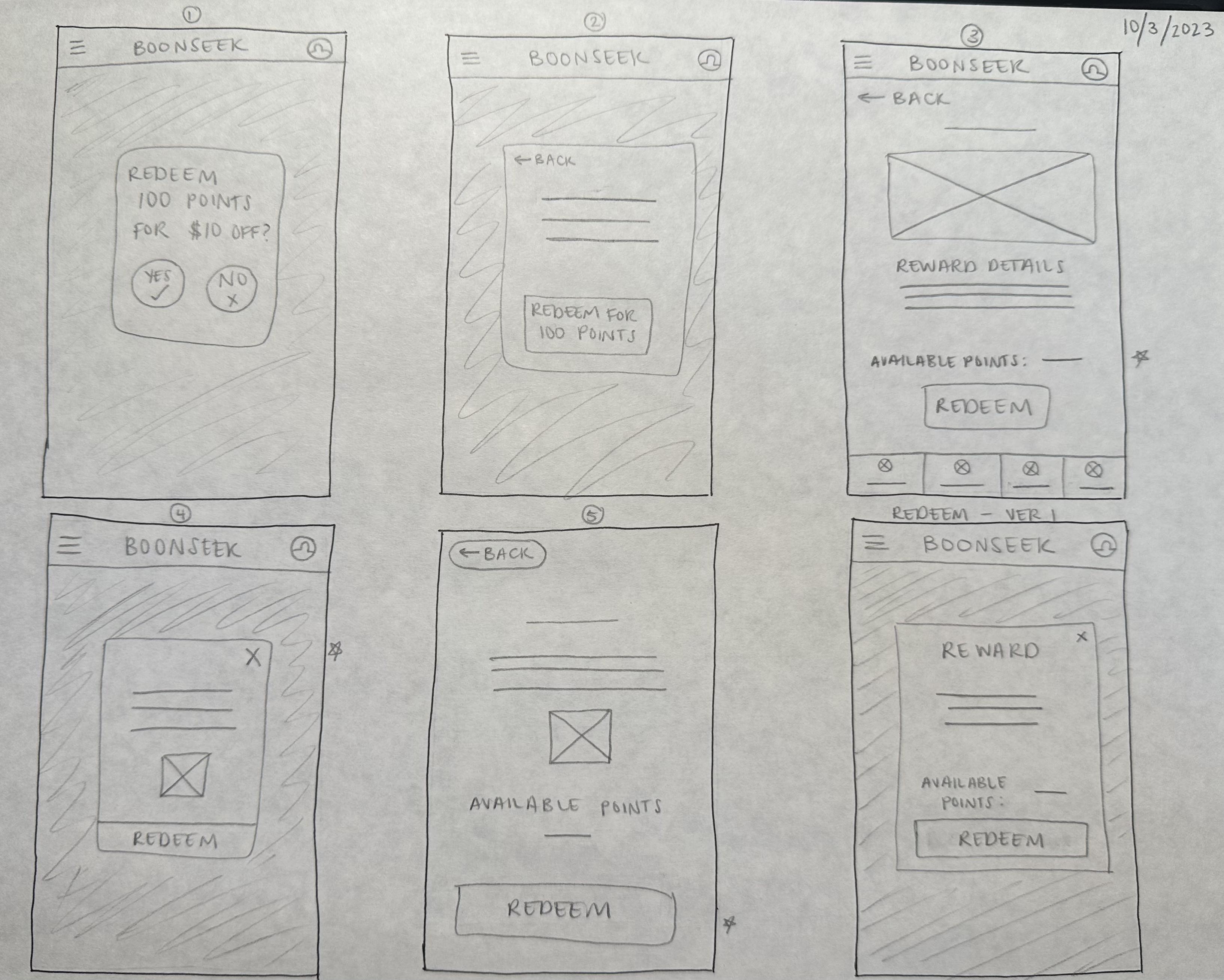
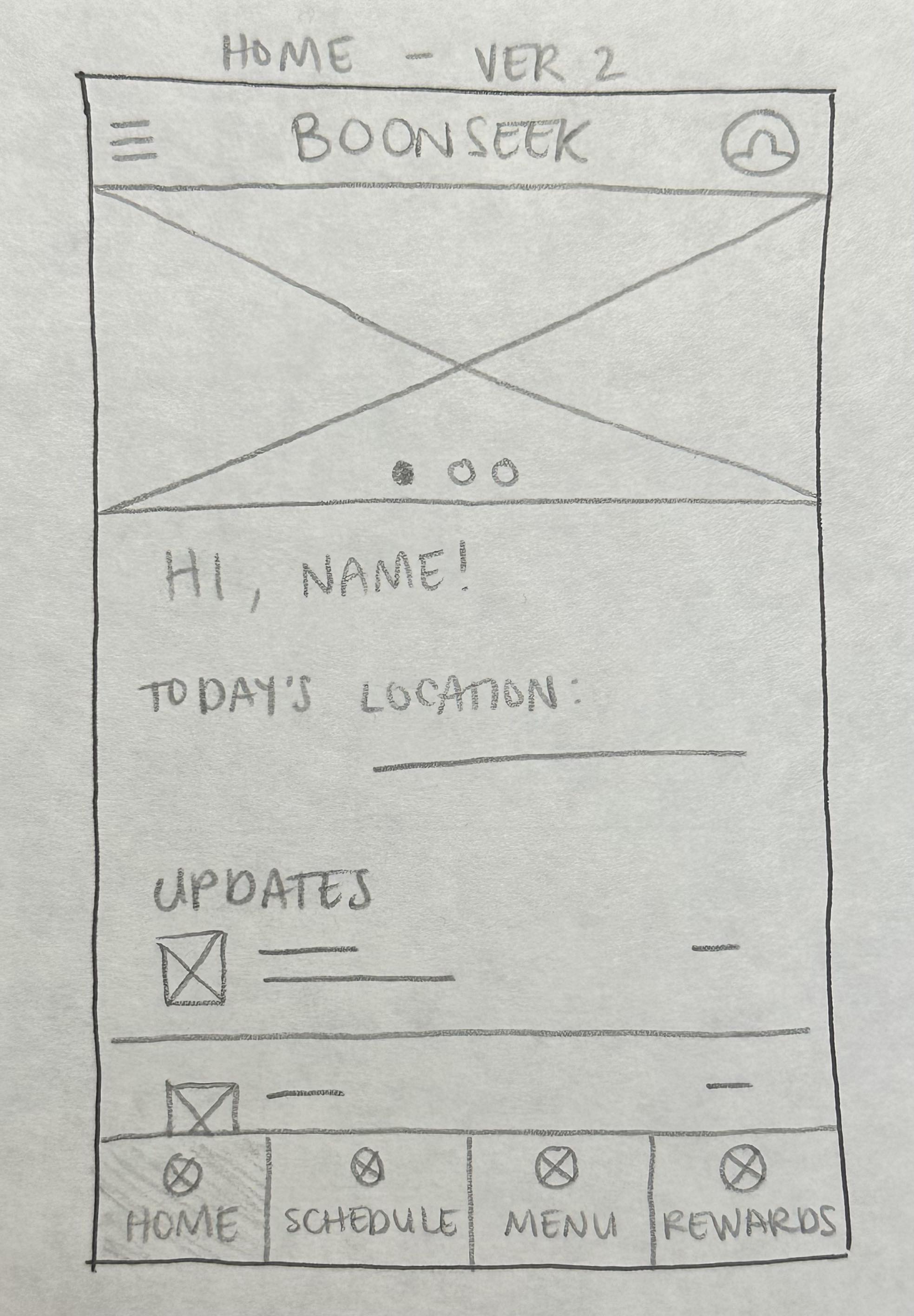
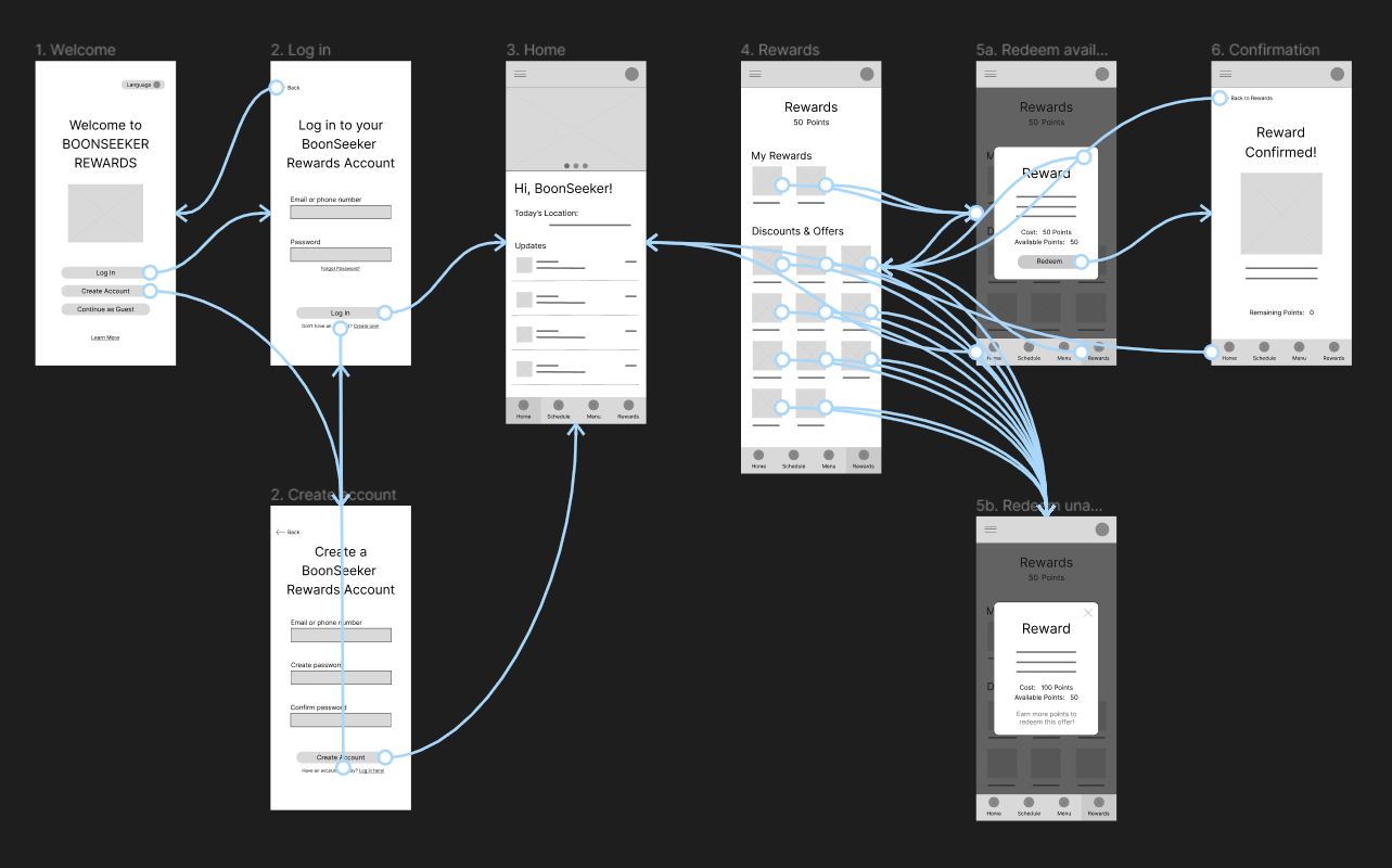
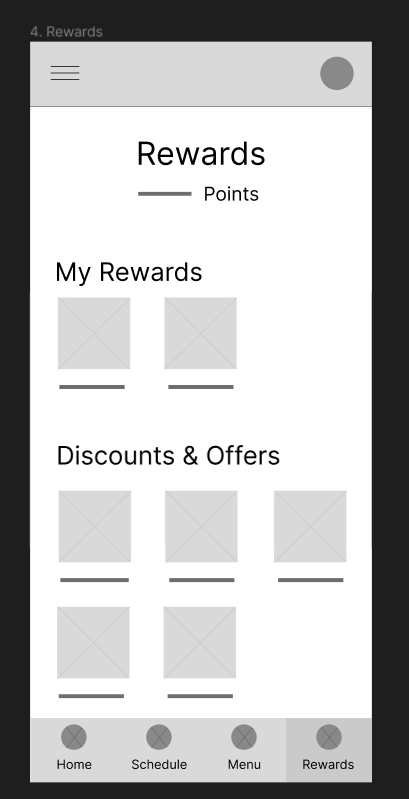
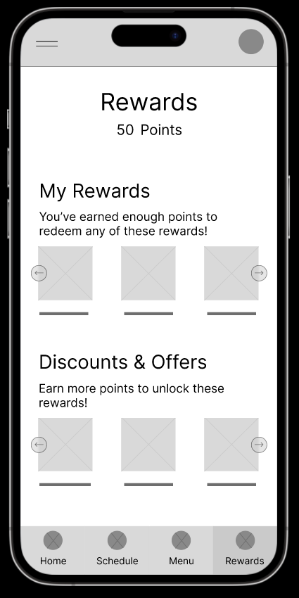
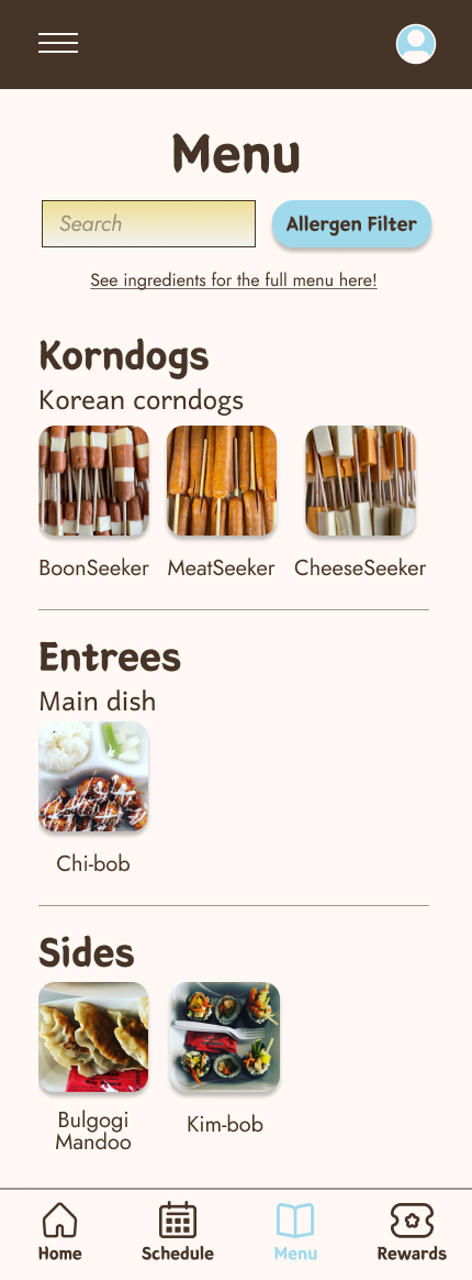
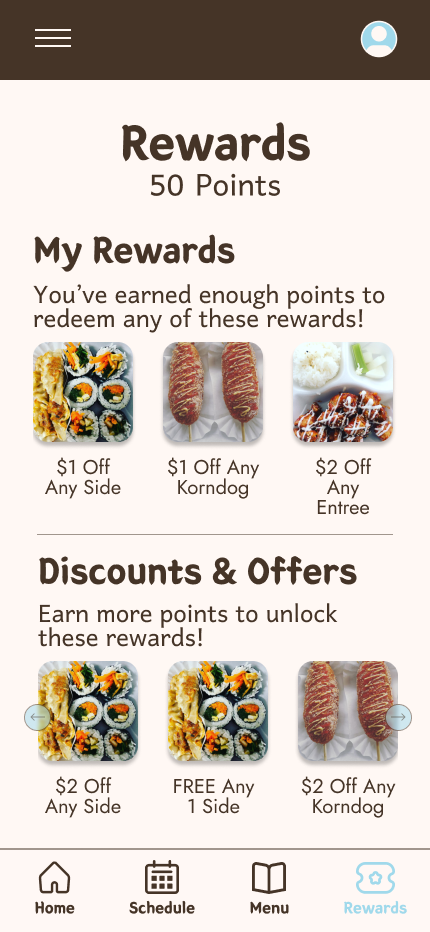
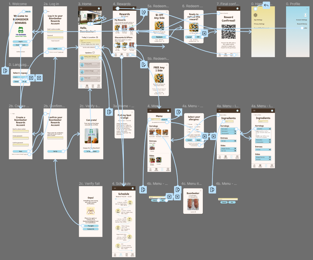
I conducted interviews with people of various ages, educational backgrounds, occupations, residences, and family, then created empathy maps to further understand the users and their needs. A user group that stood out from research is university students who are regular customers of The BoonSeek.
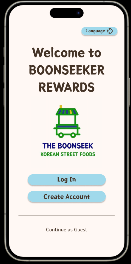
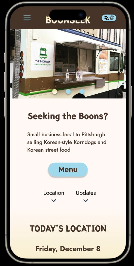
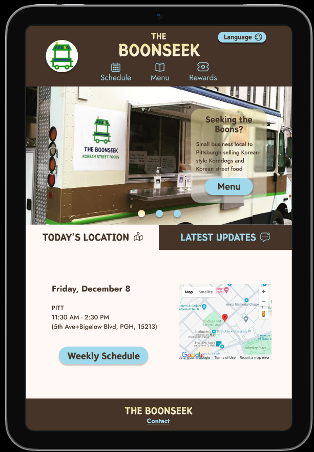
This user group reveals The BoonSeek’s success at keeping loyal customers and that a loyalty rewards app would encourage more customers to return. User problems identified in this user group include saving money, saving time, and having difficulty using apps that are confusing or overwhelming.
1. Cluttered Screens
Users are overwhelmed when presented with screens that try to fit too many buttons, features, and pop-ups on their mobile devices. A simplistic appearance with navigation for only necessary functions would reduce visual clutter.
2. Unclear or missing instructions
Users can be easily confused how to collect rewards when not directly instructed, left unsure of the app’s navigation and functionality. Screens dedicated to instructing users on functions can ease them into the app and prevent confusion.
3. Unreadable text
Users have difficulty reading texts of small size, poor fonts and colors, and lengthy paragraphs. Choosing appropriate text styles and keeping descriptions succinct and straightforward would prevent eye strain and allow users to do tasks more quickly.
4. Lack of translation
Non-native language speakers tend to have difficulty understanding English-centric apps. Including translation for all elements within the app can bridge the gap between business and customer created by language barrier.
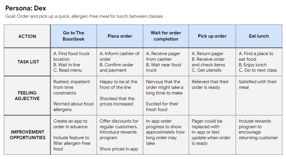
Problem statement: Dex is a university student who needs discounts on allergen-safe meals to keep expenses low so that they can still pay for tuition and rent.

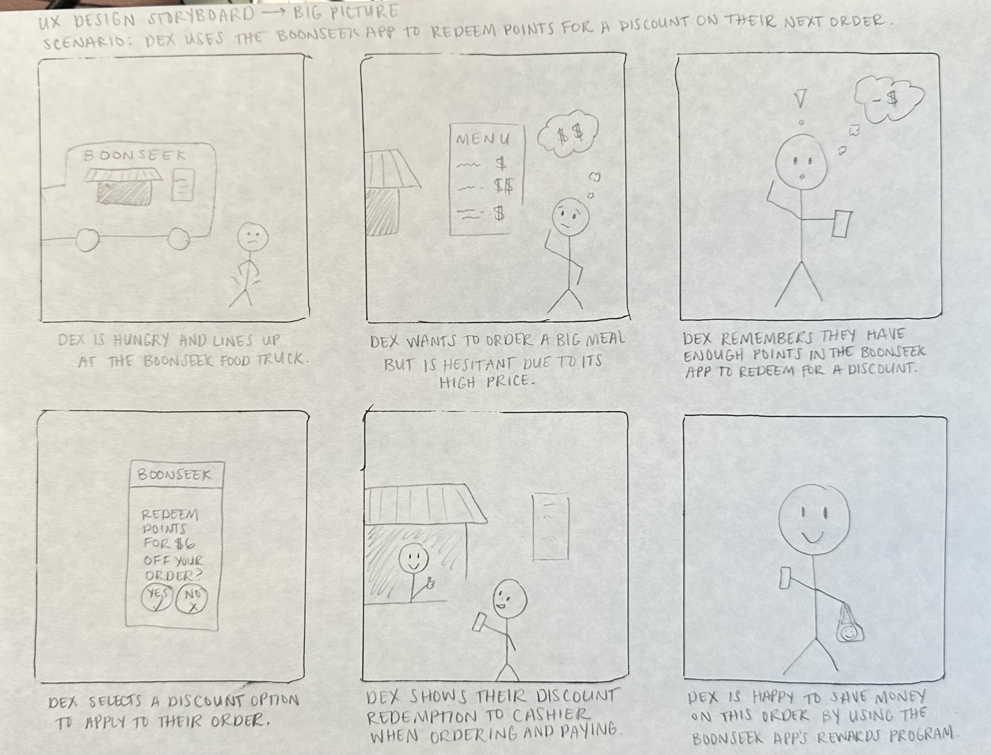
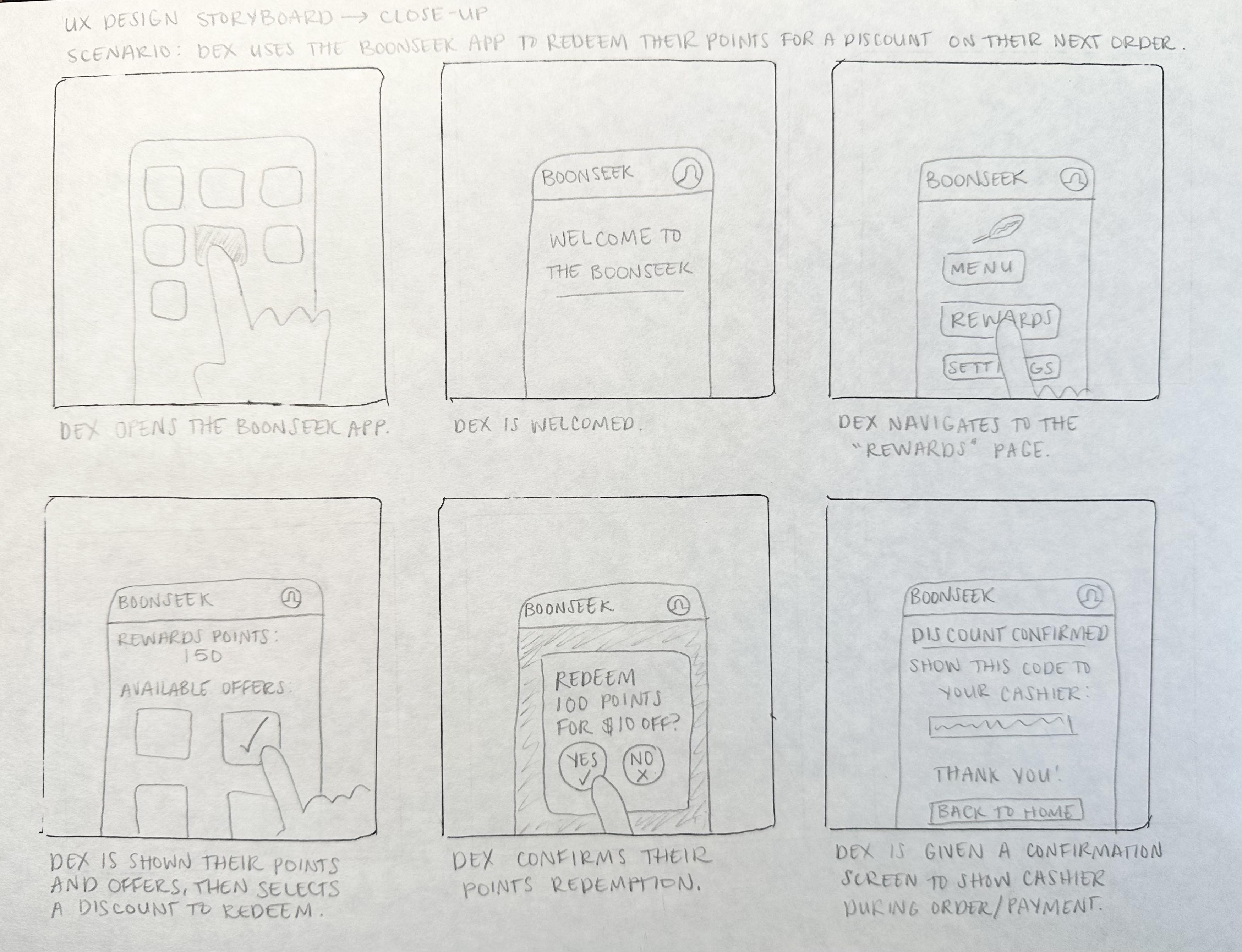
Mapping Dex’s user journey revealed how an app for The BoonSeek could address pain points related to expenses and allergen accommodation.
